Koni
UX/UI Design | Web Design | Visual Design
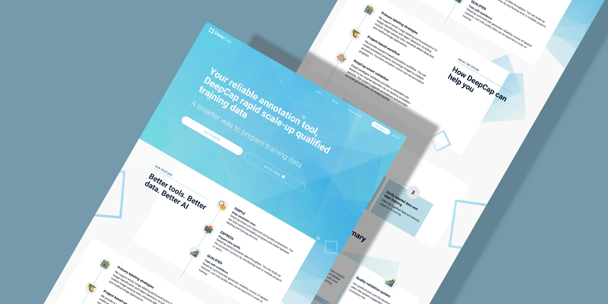
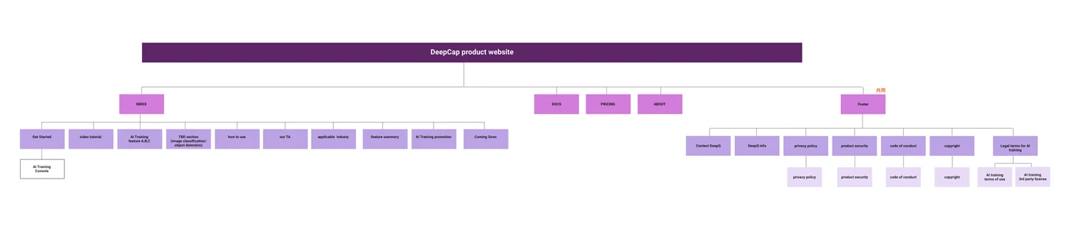
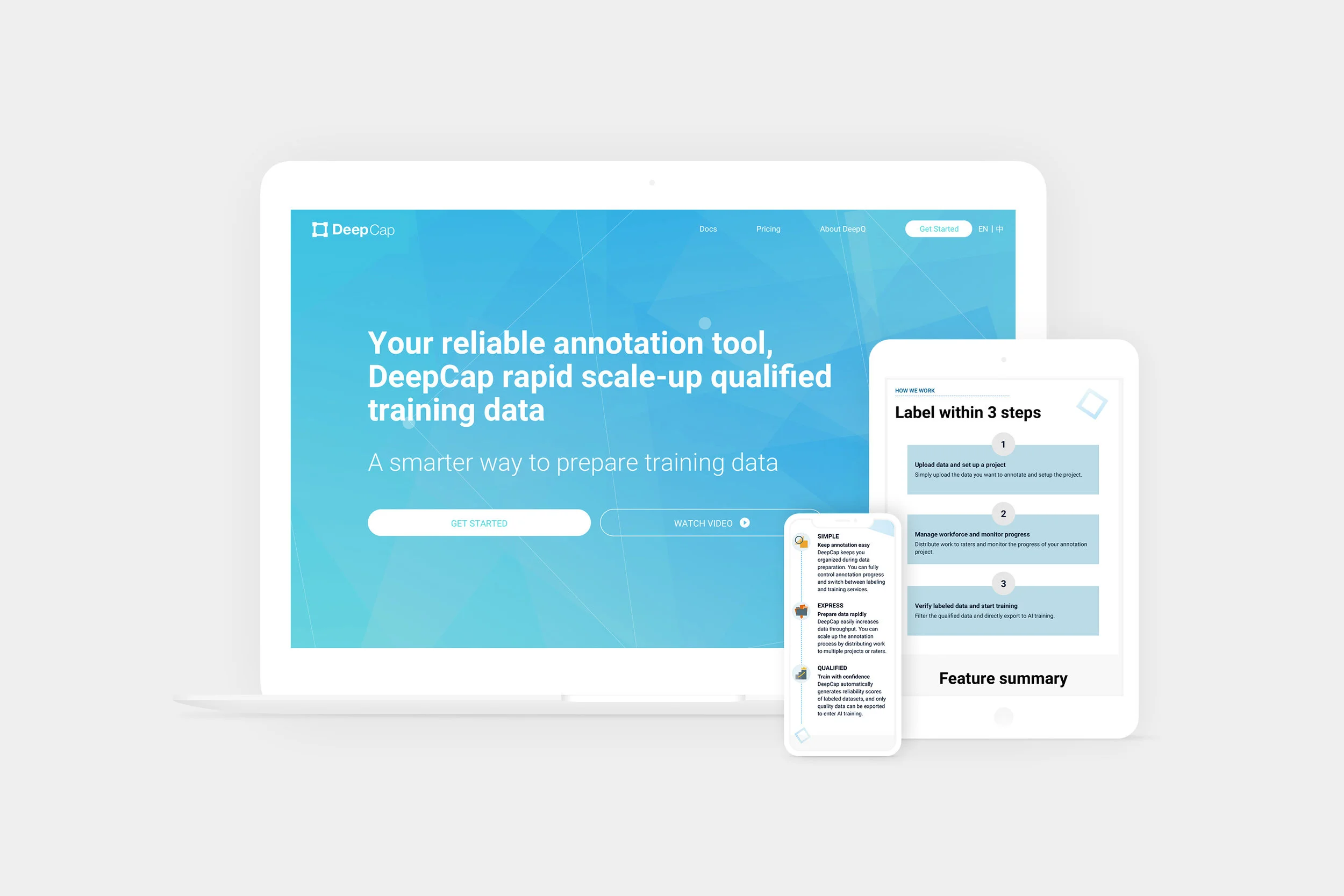
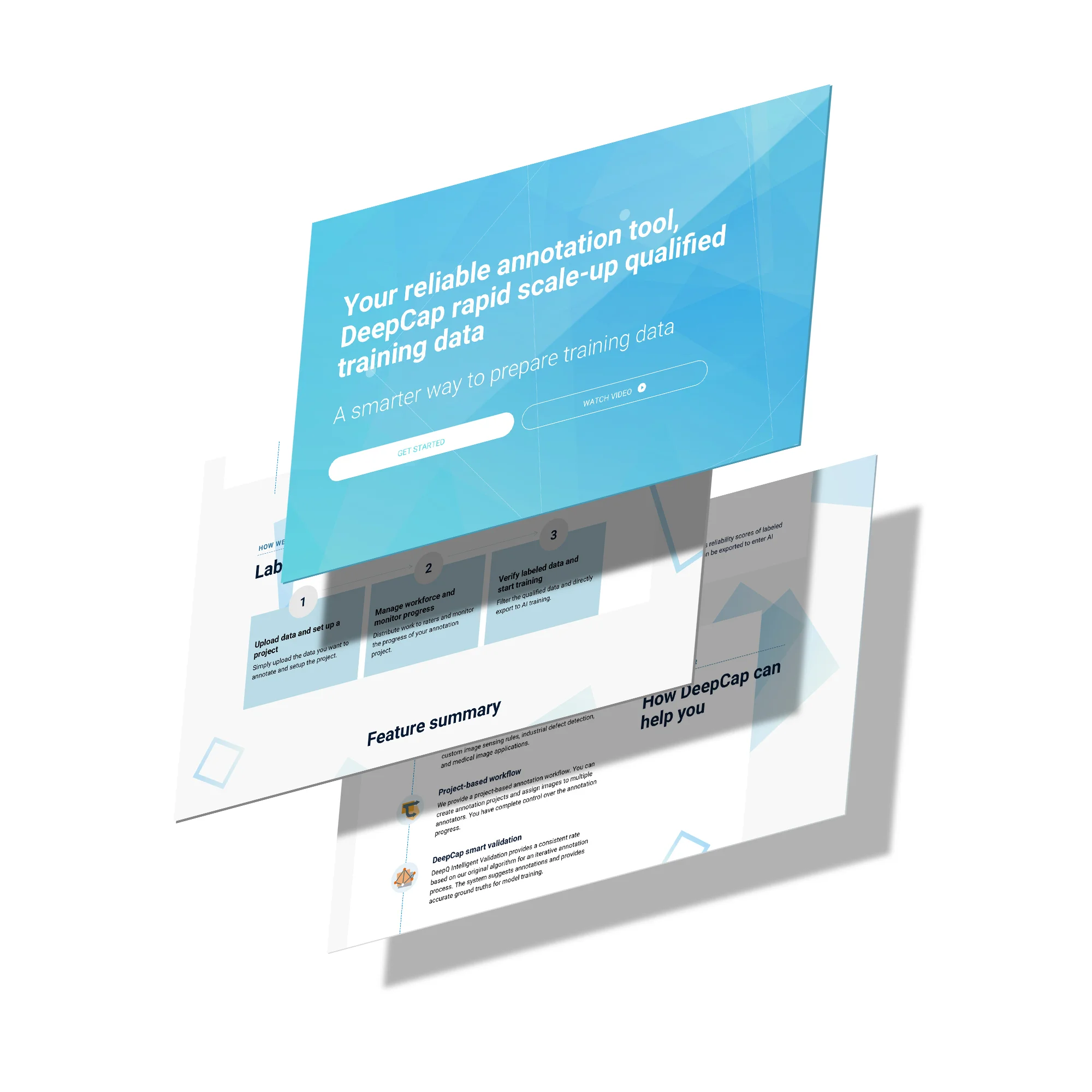
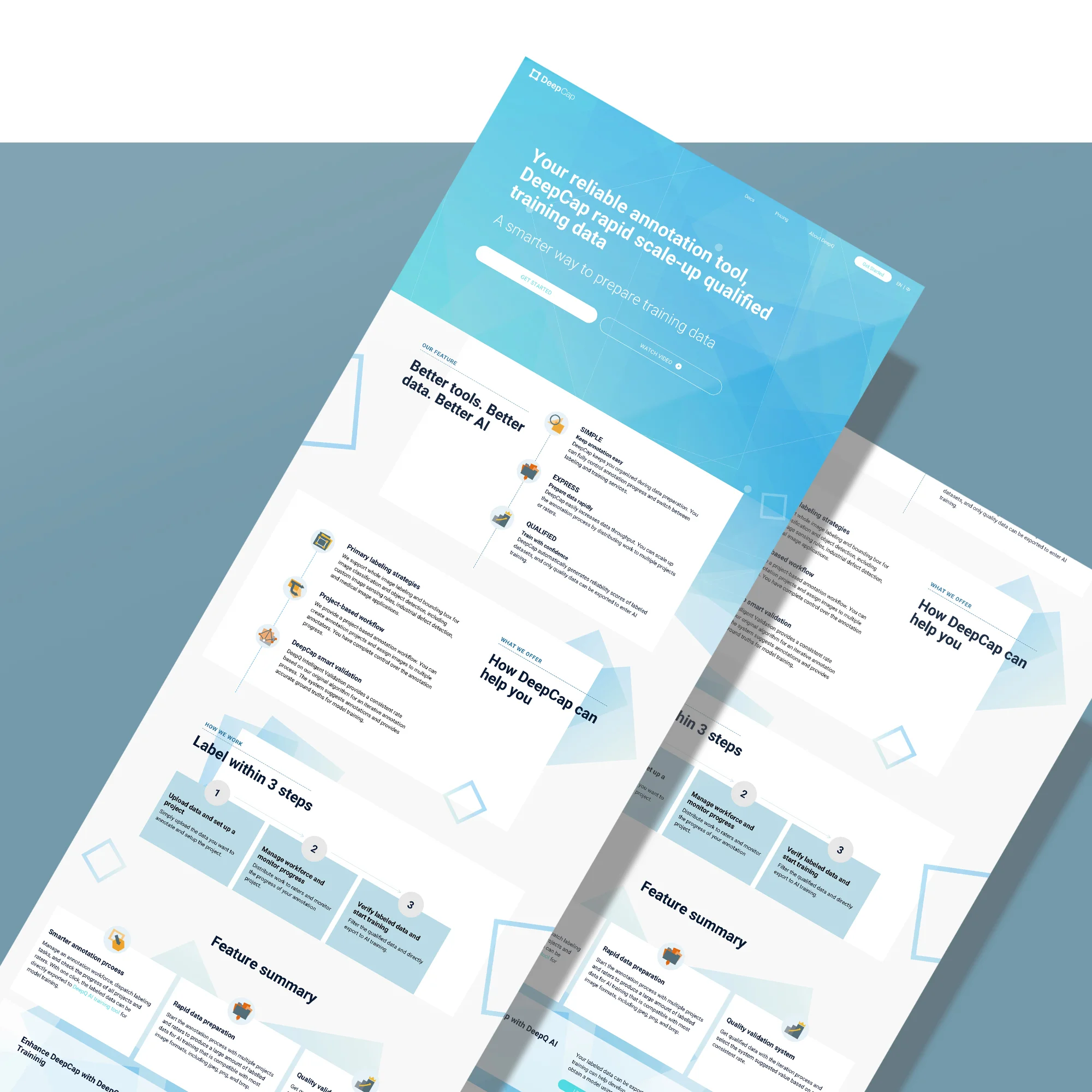
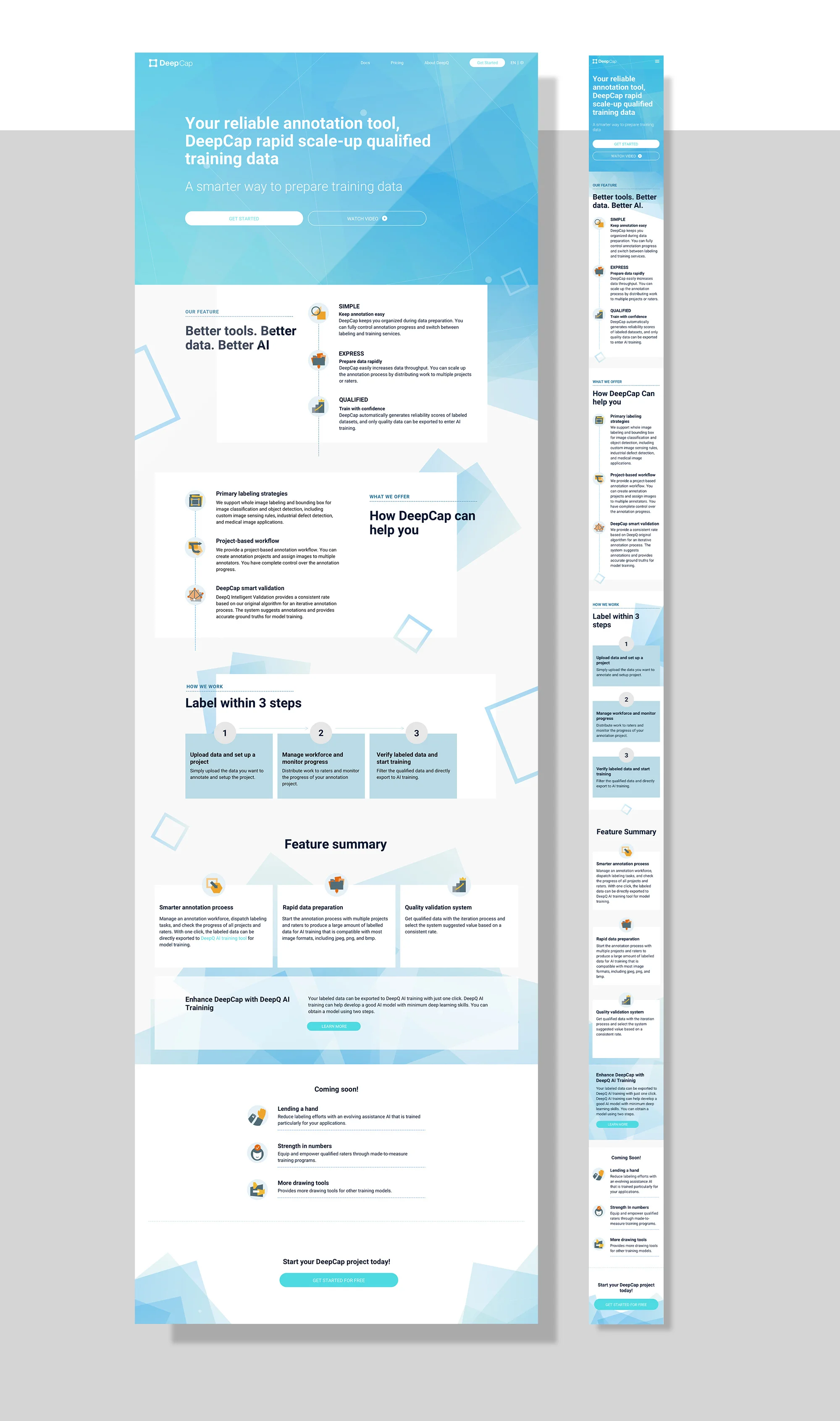
Product website — Annotation Tool
As the saying goes, "garbage in, garbage out". To successfully train an AI model , one of the important things is to have high-quality labeled images. The annotation tool is a handy tool that aims to help people get high-quality images.
My role: UX/UI, visual design
Design concept
The design concept was inspired by "images" — which is what the product was all about. We used squares as the metaphor of "image", and also kept the visual consistency with another related product "AI training tool" by using geometric shapes in stead of organic elements.
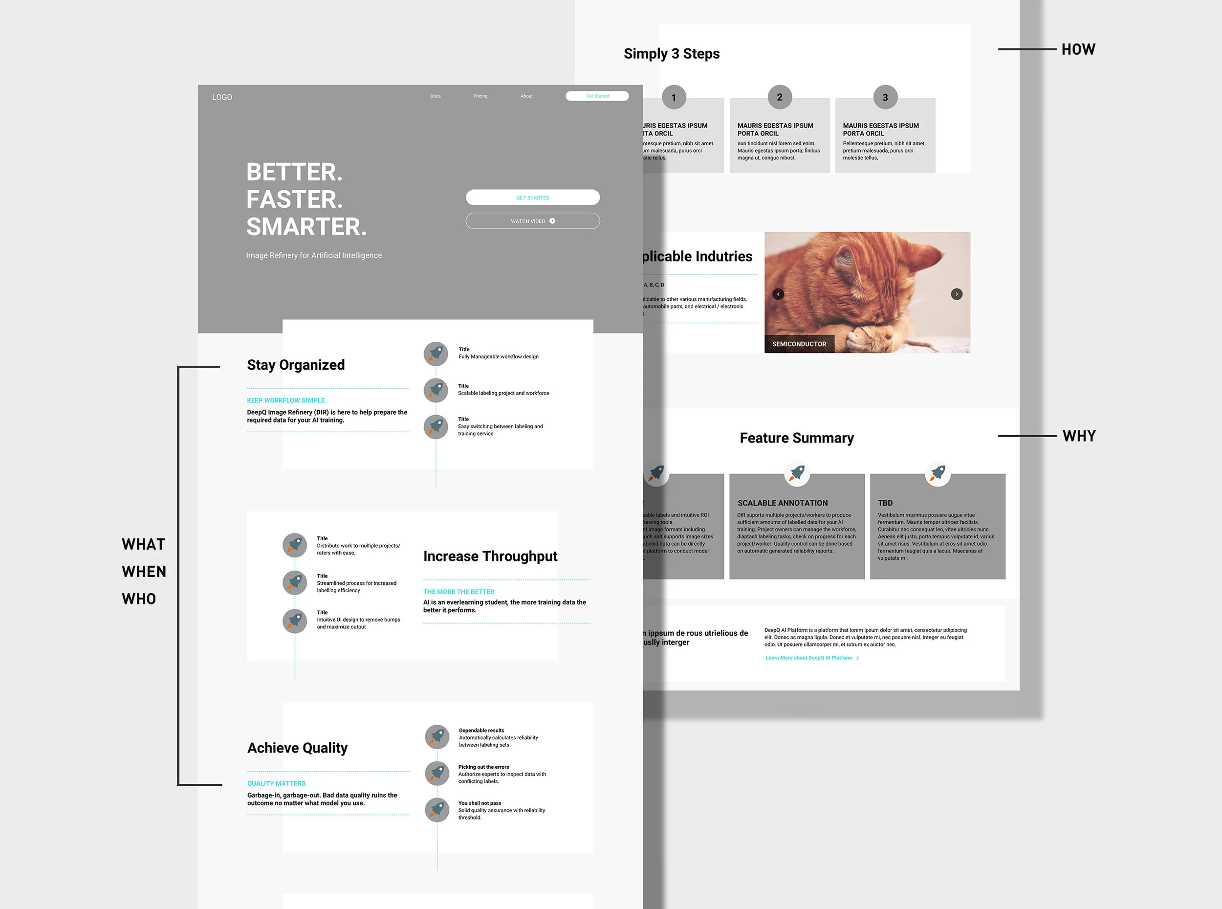
5W1H
This website serves as an online manual to introduce (and promote) our product to people. To build structure from 0 to 1, we used 5W1H to help us clarify key points.
WHAT — what we offer (a brief introduction of the product)
WHO — Who our TA is (content scattered in different paragraphs)
WHERE — (not specified in the website)
WHEN — When to use (it's online, so we are available 24/7)
WHY — Why you should use (our features and selling point)
HOW — How to use (a brief summary of instruction )